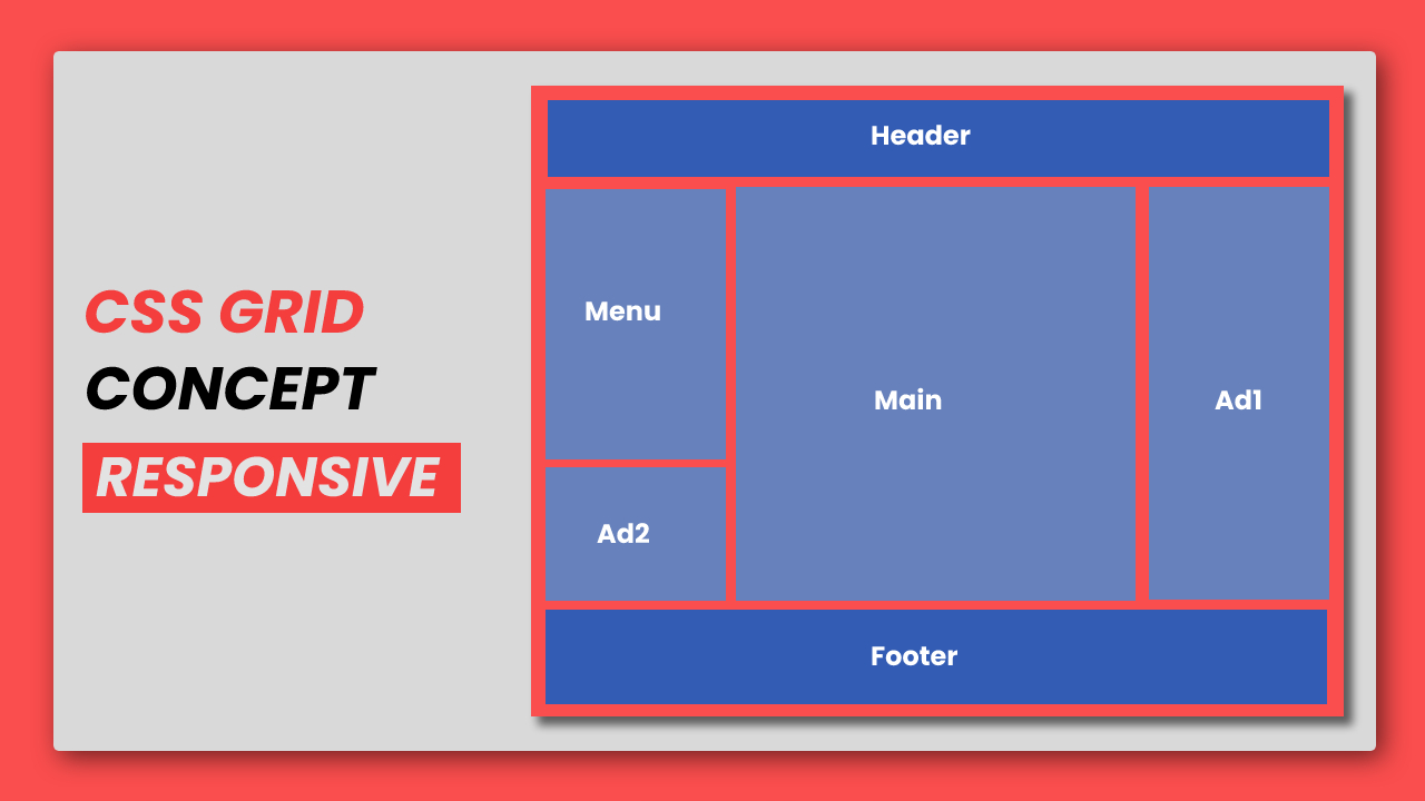
Navigating the Landscape of Responsive Web Design Coding
Responsive web design has become a crucial aspect of creating web applications that adapt seamlessly to various devices and screen sizes. In this article, we will explore efficient coding techniques for responsive web design, ensuring a user-friendly experience across a spectrum of devices.
Understanding the Essence of Responsive Web Design
Responsive web design aims to provide an optimal viewing and interaction experience, ensuring that a website or application works seamlessly across devices, from desktops to smartphones. At its core, responsive design relies on fluid grids, flexible images, and media queries to create a dynamic and adaptive layout.
Embracing Fluid Grids for Layout Flexibility
One key component of responsive web design coding is the use of fluid grids. Instead of fixed-width layouts, fluid grids use relative units like percentages for width, allowing elements to resize proportionally based on the user’s device screen. This flexibility ensures that content is displayed appropriately regardless of the screen size.
Utilizing Flexible Images and Media
In addition to fluid grids, responsive design incorporates flexible images and media elements. CSS techniques such as max-width: 100% ensure that images scale proportionally within their containing elements. For multimedia content, HTML5 introduced the <picture> element, enabling developers to provide multiple sources of media based on device characteristics.
Employing Media Queries for Device Adaptability
Media queries are a cornerstone of responsive web design coding. These queries enable developers to apply different styles and layouts based on various device characteristics, such as screen width, height, or resolution. Media queries allow for a tailored user experience, ensuring that the design adjusts seamlessly to the device’s capabilities.
Mobile-First Approach: Prioritizing Small Screens
A mobile-first approach involves designing for smaller screens first and then progressively enhancing the layout for larger screens. This approach ensures that the essential content and functionality are optimized for mobile users, providing a solid foundation for scaling up to larger devices. CSS media queries play a vital role in implementing the mobile-first strategy.
Flexible Typography for Readability
Responsive web design extends beyond layout to include typography. Ensuring that text is readable on various devices requires the use of relative units for font sizes, such as em or rem. Responsive typography adapts to different screen sizes, providing an optimal reading experience without compromising design integrity.
Testing Across Devices and Browsers
Efficient responsive web design coding involves rigorous testing across a diverse range of devices and browsers. Utilizing browser developer tools and online testing platforms helps identify and address issues related to responsiveness. Thorough testing is crucial to delivering a consistent and polished experience for users across the digital landscape.
Progressive Enhancement for Enhanced Experiences
Progressive enhancement is a coding strategy that begins with a basic, functional version of a website and progressively adds enhancements for devices with larger screens or more advanced capabilities. This approach ensures that the core functionality is accessible to all users while providing additional features for those with more capable devices.
Continuous Learning in a Dynamic Field
The field of web development, including responsive web design coding, is dynamic and continually evolving. Staying updated on new techniques, tools, and best practices is essential for delivering cutting-edge and user-friendly experiences. Engaging with the web development community, attending conferences, and exploring online resources contribute to continuous learning.
Learn Responsive Web Design Coding: A Guided Journey
For those eager to dive into the intricacies of responsive web design coding, a valuable resource awaits here. This link provides a guided approach, offering tutorials, tips, and insights to help developers master the art of responsive web design. With a structured learning path, it serves as a compass for navigating the landscape of responsive design and creating web applications that excel in user experience.
This article explores the realm of responsive web design coding, covering fundamental principles such as fluid grids, flexible images, and media queries. It emphasizes the importance of a mobile-first approach, adaptable typography, thorough testing, and continuous learning in this dynamic field. The inclusion of a resource link offers a guided approach for developers seeking to master responsive web design coding.
